Salinas Group is one of the largest financial companies in Mexico, thanks to its Azteca Bank, whose objective is the economic base of Mexican society. It has one of the most significant financial movements in Mexico, 365 days a year. However, Salinas Group has other companies such as the "Elektra" furniture and appliance store, the "Dragón Group" wind energy generator, the "TV Azteca" television channel, etc. In this case, we will focus on the motorcycle manufacturer and store "Italika".
The accessory manager system already existed; it was an old, slow, but functional system. At this stage, where Grupo Salinas improved its software, I had the opportunity to update this SaaS. My participation as a UX/UI designer began when I analyzed the function and objective of the system, understanding the migration to a new technology until I developed the flows and prototype of a new design for desktop and iPad.
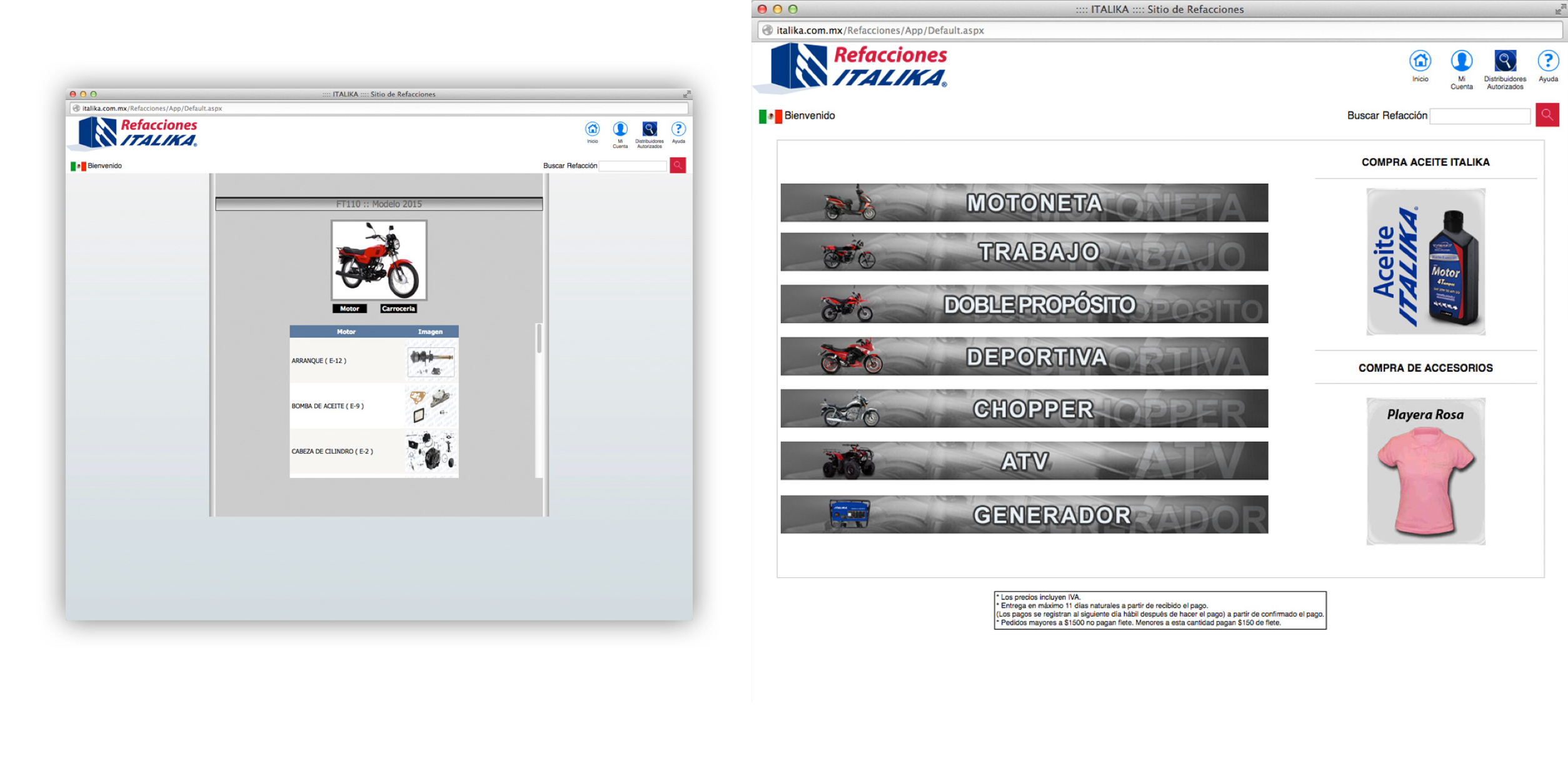
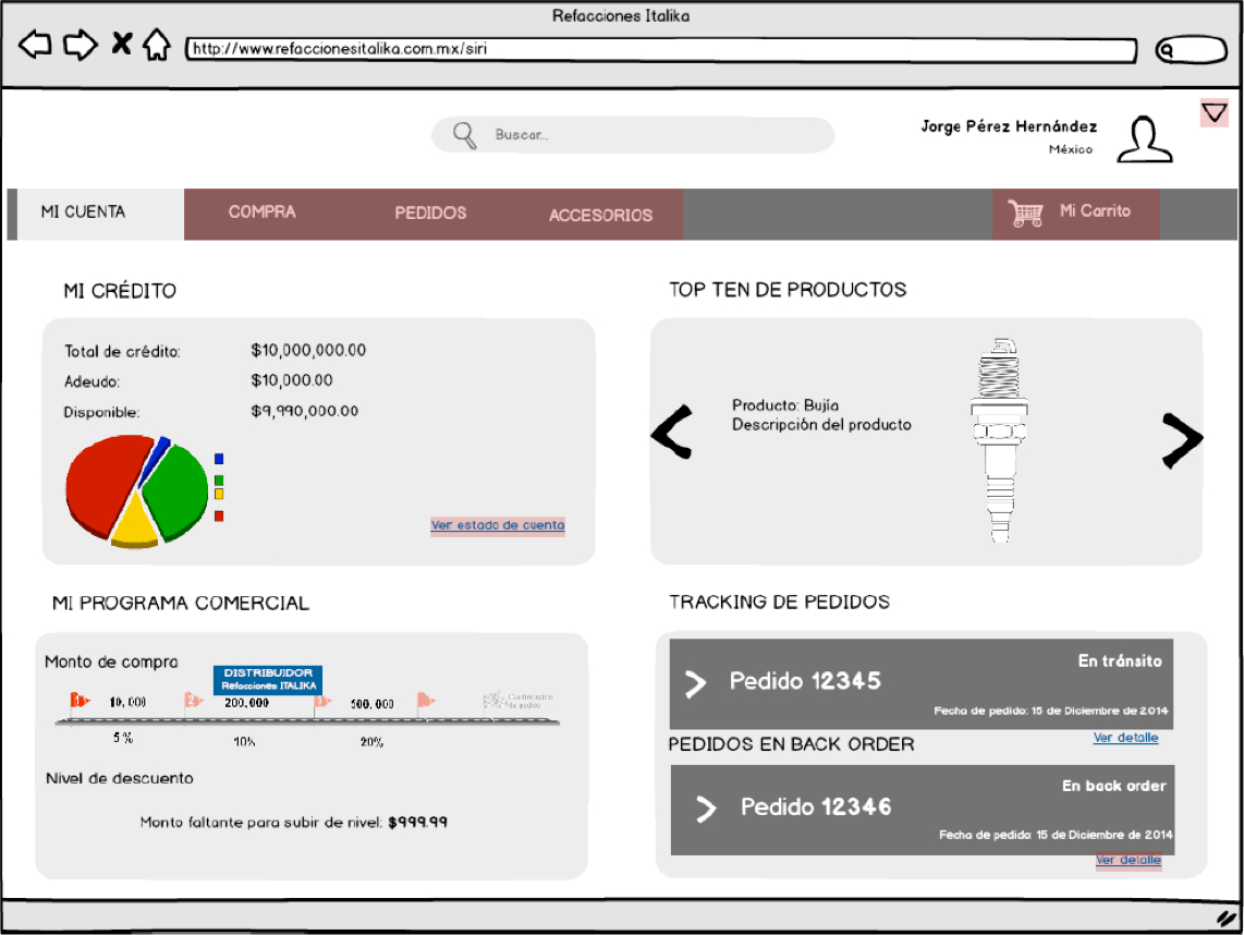
Faced with the need to update the system and migrate it, the Product Owner decided to generate a new version of the software, mainly for desktop and iPad.
Since it is a SaaS focused on controlling the inventory of motorcycle parts controlled by specific users who work in Italika's workshops in Mexico, the best option was to work with existing graphic elements that users already knew to improve processes, save response time, and less margin of error.
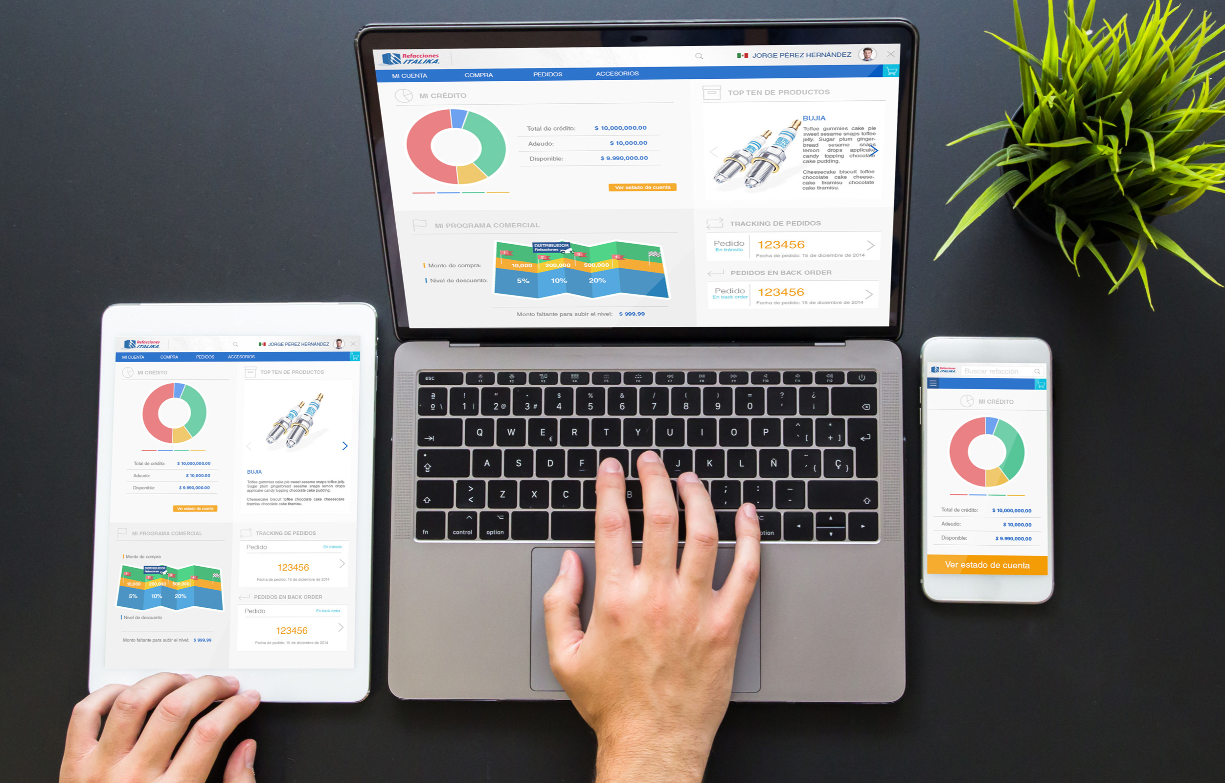
Users were happy to know that they could check their inventory through the tablets provided by the company, with a new look and feel, intuitive and easy. They also seemed comfortable knowing they could check stock at the desktop like they used to.
After understanding the system's functionality, a few meetings with the product owner, business analyst, and development team, and some "brainstorming" sessions, I started creating some sketches to show the team the different ways we could improve the functionality and performance of the software. Several of my proposals were discarded for multiple reasons, such as not meeting the proposed functionality, other options having to go through a usability test, etc. However, from there, we begin to define the characteristics of the final product.
While working on the qualitative research with the first version of the software, I discovered some features and options that the actual user did not use since, for his daily functions, he did not need them.
I observed that the operators of this software had no problem using the previous version because they were very familiar with it. However, they seemed happy to know that the software would have a new look and feel, and the idea that they would be able to use the software on the tablet the company gave them made them very excited.
We work on the update and migration of Saas focused on controlling and managing the entire inventory of accessories of the "Italika" motorcycle workshops.
The new vision of the project was created to work on PCs and tablets with a "flat" look and feel and accelerate the response time and reduce the margin of error in controlling the input and output of accessories.
One of the biggest challenges of this project was to understand the scope of the software, map all the flows and restructure the processes. My best ally was the User-Centered Process to overcome all of the above. With some of its elements and correct qualitative research, we obtained an excellent product.
Through previous qualitative research and a broad understanding of the system's functionality, I developed some sketches that were discarded. Finally, when the flow was defined, I began to work with the "red routes," from there, I elaborated the graphic proposal developing the prototype at a high level. At the same time, the developer team was working on the back end, building SaaS functionality.
We developed some usability testing sessions with real users, which helped us generate the correct changes by observing the reactions and doubts of the users.
We generated all the improvements, had some meetings with the team members, and showed the final project. The product owner requested other fixes, and we evaluated, improved, and tested them. Finally, we launched the project seven months later. However, we continued to make some changes to the final product.
I can say that this project was a fun activity because all the team members and users who participated in it were very objective and optimistic about the final result. We did not have many stoppers. The Product Owner was very open with the proposals, and the developers tried to take advantage of all the benefits that the technological language offered.
In the end, I understood that sometimes could develop projects smoothly, there are changes every day, but that is the day-to-day of a UX/UI Designer and developer.