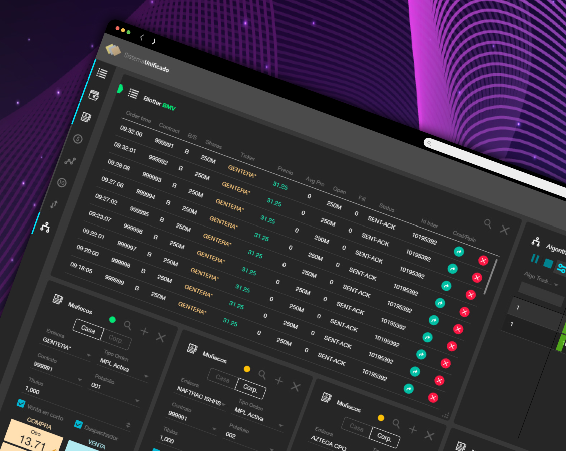
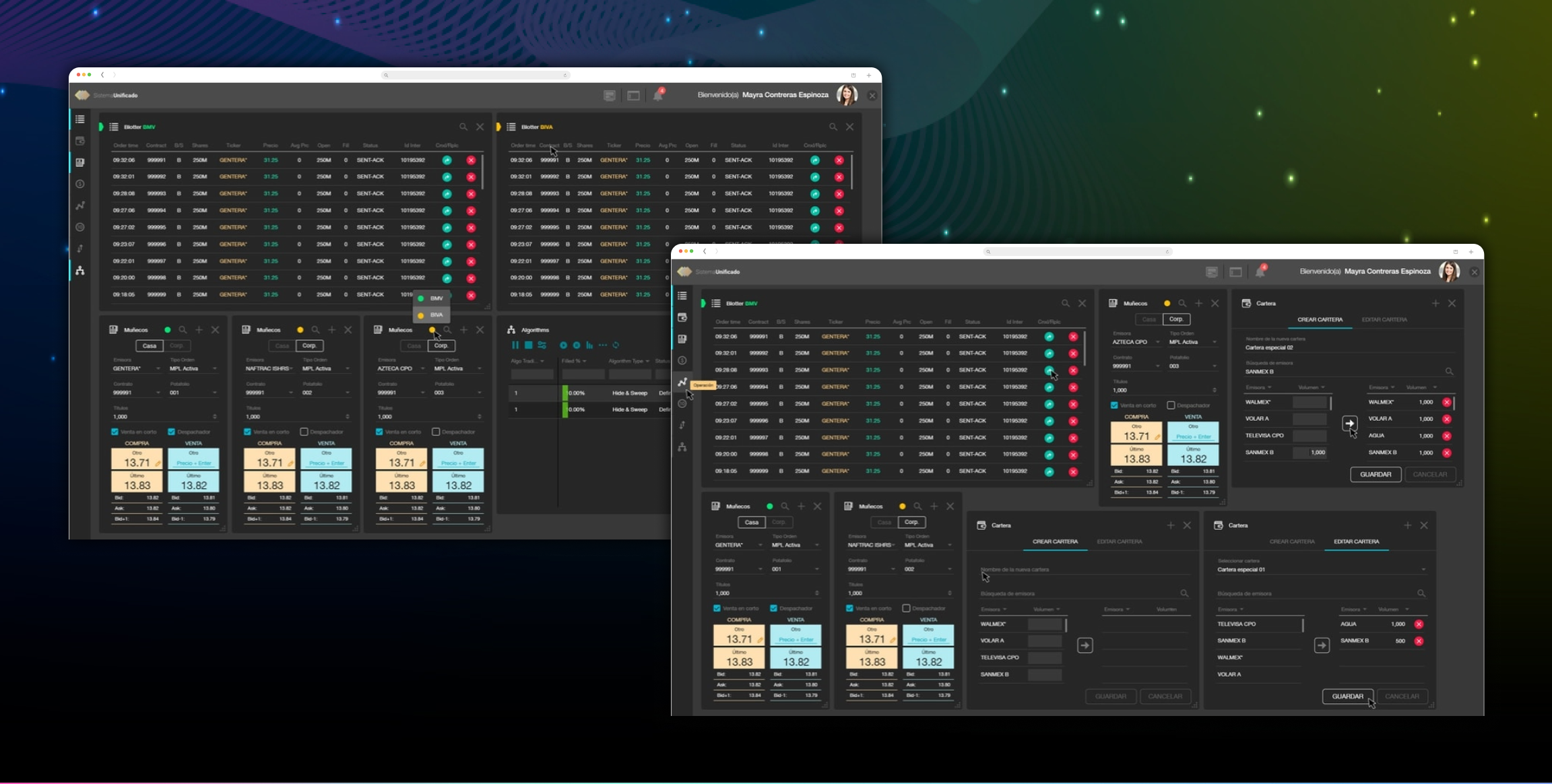
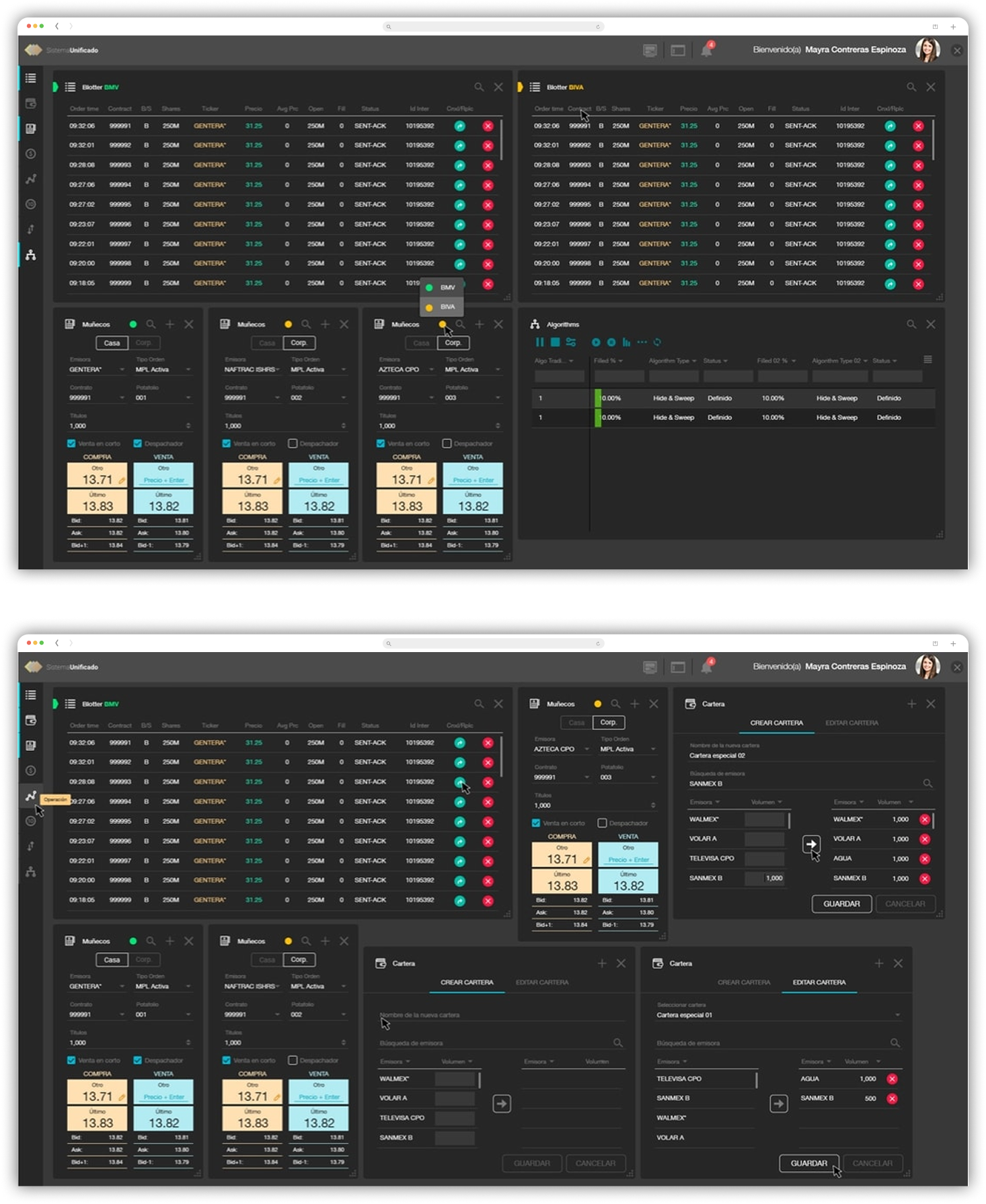
Transactional System

GBM, in a moment of evolution, is projected towards the digital future.

As part of the technological renovation that GBM is undergoing, the Transactional System, which is the company's most important SaaS, is the platform where GBM executives monitor all financial movements in the stock market throughout the day; had its own digital enhancement. We generated a solid and effective product through a multidisciplinary team of developers, IT architects, business analysts, UX designers, and UI designers.

My role.

In collaboration with the UX researcher and through various meetings with GBM executives, we began the analysis of the functionality of this software; we detected weak points; understood the objectives of each tool and element.

We downloaded all this information to our work platform; from here, we begin to create the map for each flow detected during the previous analysis.

A customized platform.

Because it is a software where users with different profiles work, we decided to develop a platform where through widgets, each user can customize their screen; so they can see the information they need, allowing them to stay focused on their job, and don't get distracted by other details they don't need.

We decided to display the information through charts, tables, comparators, etc.

Process.

Through various meetings with GBM executives, the UX Research and I generated the qualitative research of the previous version of the platform; after that, we started creating the "red routes" and the rest of the flows. Throughout this process, we detect some weak points and other points of interest that we take advantage of to create a faster and more accurate system. Finally, we begin to make sketches to define the look and feel of the system.

The discovery.

Thanks to qualitative research, we found that the previous version of the app was a good tool; however, we did see some issues that we could fix. We eliminated some processes that were not necessary for the final objective of the product.

The vision.

We developed intuitive software where the user's learning curve is short. 

We needed a customizable, solid, and not a very colorful platform, where the indicators would highlight the content, showing the data with which the executives carry out their activities.

Challenge.

The big challenge in this project was the deadline; we needed to show rapid progress in the process. I was focused 100% on solving it; sometimes, I received help from my teammates, which was good since several GBM members got to know the system.

Approach.

Due to the characteristics of the project, the Product Owner requested graphic proposals in two versions, one with a white background and the other with a black background. We showed several proposals, he selected one, and after several corrections, we began to work with a single graphic line. In this case, the prototype process was speedy, and the development team worked simultaneously. We launched the first version of the SaaS, and from there, we generated the usability tests with the executives.

We continued to improve the platform in real-time while it was running.

Learnings.

Thanks to this project, I discovered the benefits of working with widgets; they are excellent tools that allow users to customize their digital work platform and work with the tools they need since these platforms are enabled for different types of profiles.

Finally, each company and project are different, which allows me to understand that I have to adapt my user-centered design process depending on the characteristics of the teams, deadlines, priorities, etc.