GBM is the leading investment firm promoting national and foreign investment in Mexico; its SaaS meets all quality control requirements to protect all users' financial information. From 2017 to the present, this company has been undergoing a digital transformation to improve, accelerate and modernize its services, update systems, and reinforce the quality of information security. Here is where I put my grain of sand to achieve those goals.

As UX/UI designer, my job was to get involved in all the needs and characteristics of the project. From the beginning, through several meetings with the product owner and the development team, we defined the project's requirements, which allowed me to start my analysis and qualitative research.

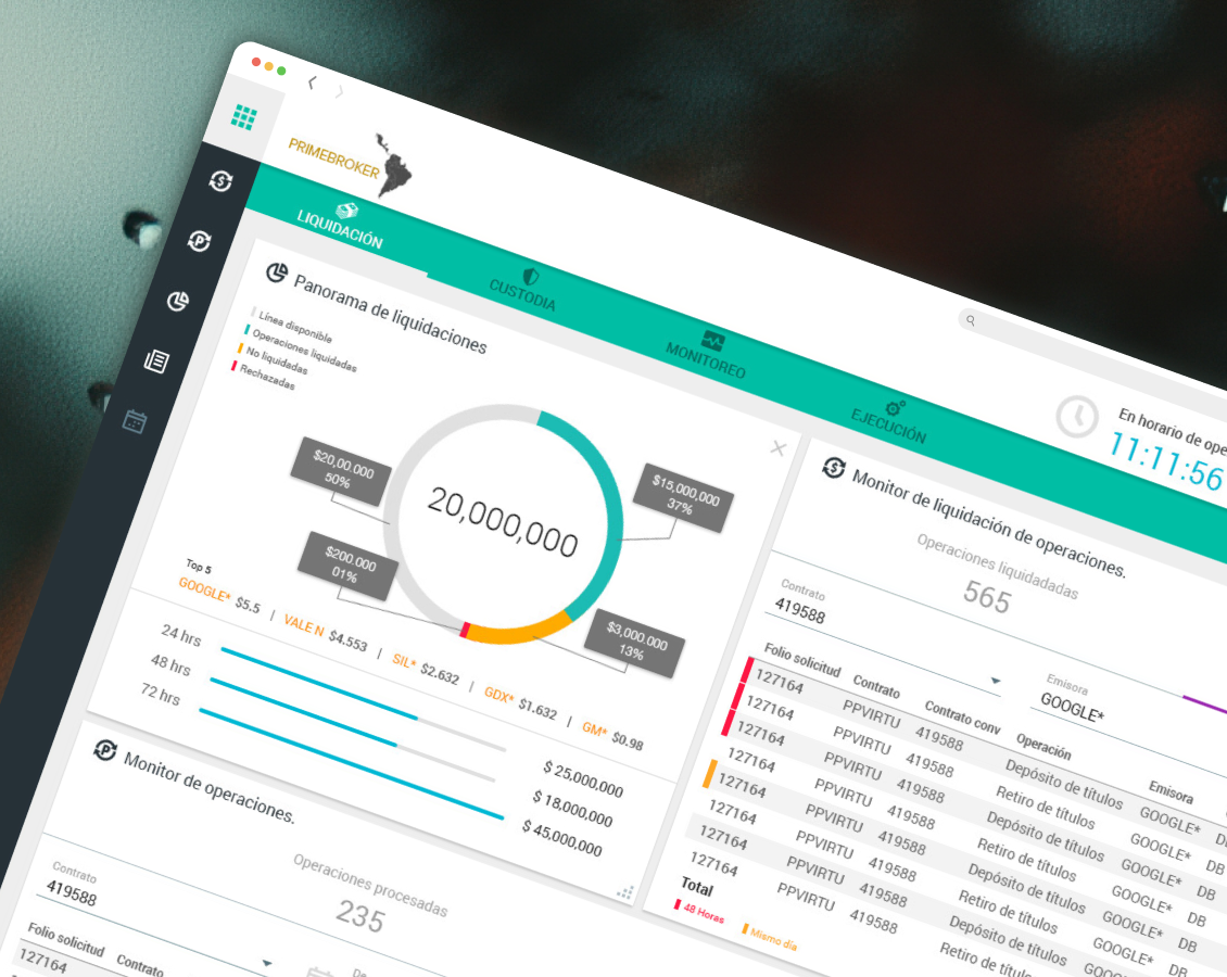
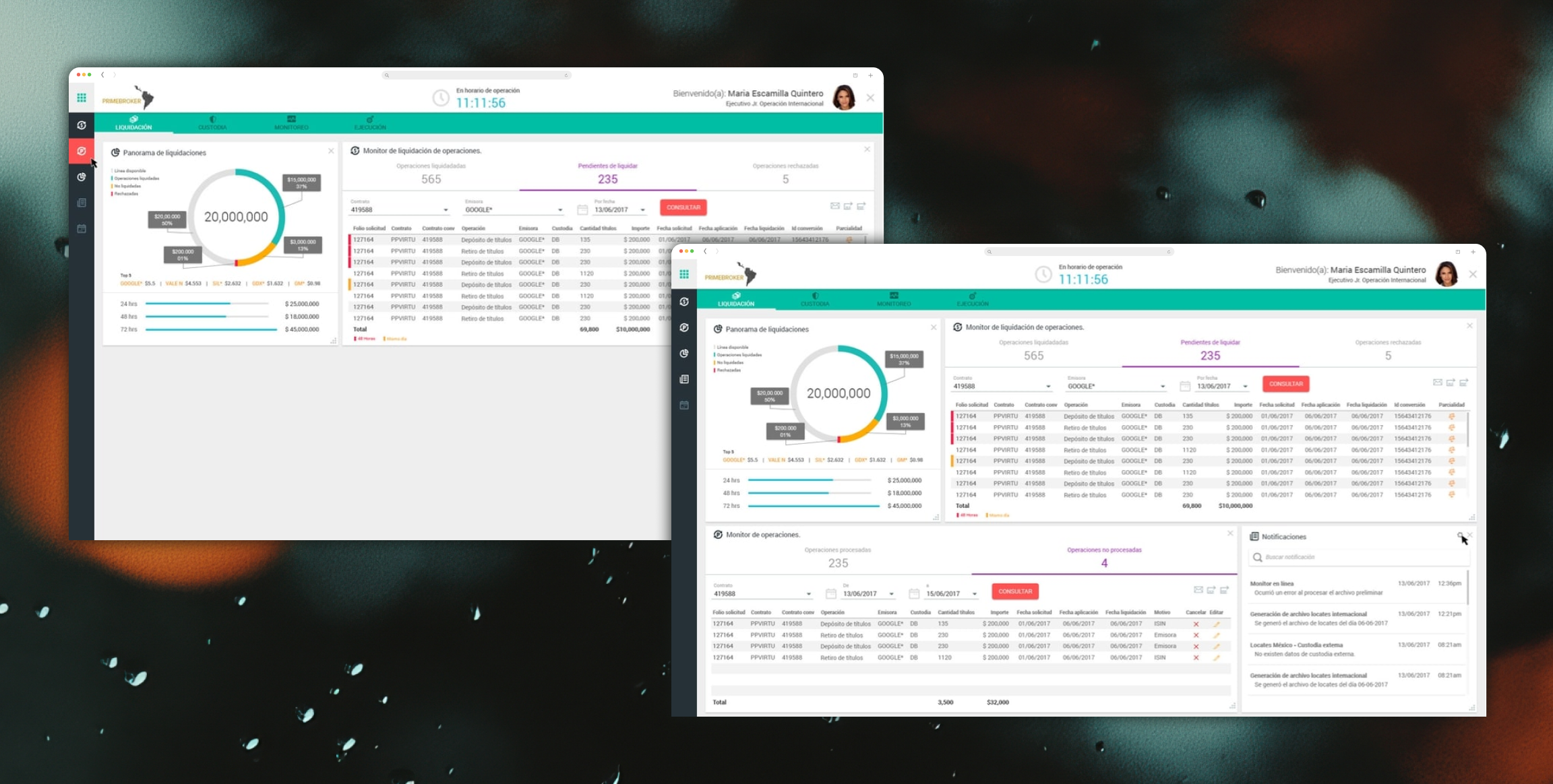
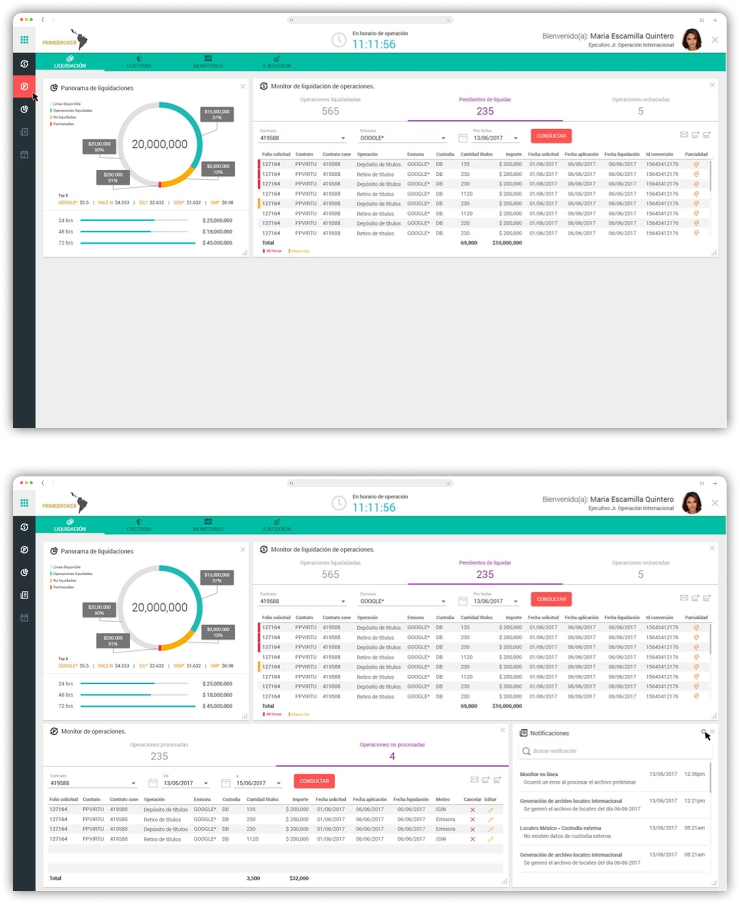
Because it is a software where users with different profiles work, we decided to develop a platform where through widgets, each user can customize their screen; so they can see the information they need, allowing them to stay focused on their job, and don't get distracted by other details they don't need.
We decided to display the information through charts, tables, comparators, etc.


Through several meetings with the product owner and the development team to define the requirements of the project; developing qualitative research, and after some usability tests with users who worked with the previous version of the platform; I started to generate sketches of the red routes, and with the help of the team, we defined the best flows to later show them to the product owner.

Thanks mainly to usability testing with users, I detected that with the previous version of the platform, which showed information that users did not need, they could carry out their tasks without a problem.
I detected that users were excited to learn about a new version of their work tool; however, at the same time, they were a little bewildered because they thought they would have to waste more time learning how to use it.
Finally, I discovered that users are very familiar with softwares similar to Excell sheets.

We work to develop custom software that displays only the data that users need, with a fresh look and feel based on "Angular Material" concepts.
A software that can be intuitive and that the learning curve for the user is short. We needed a platform where the user could briefly observe the required information through different types of charts, tables, and comparators.
The Product Owner requested a clear, colorful look for the final product.

I had never worked with "Angular Material" before; one of my challenges was getting involved in all the concepts of these UI components in a short amount of time. To solve it, I looked for some documentation about it, but what helped me the most was the constant communication with the developers who were the experts on the subject.
Another significant challenge was defining the day-to-day users who use this platform to carry out their daily tasks. To solve it, I had to pay special attention to usability testing, ask many questions, and sometimes repeat the process more than twice.

After the processes already mentioned and the flows accepted, I met with the team to be part of the group's SCRUM sessions.
My involvement in this methodology began by developing three graphical proposals to showcase to the product owner and team.
In two more sessions where I showed the proposals with some corrections, they selected one, and I started working on the high-definition mockups generating the main flows of the product.
Finally, I continued developing other usability testing sessions with the new platform.
Fortunately, the product owner understood the results of all the usability and gave us the green light to proceed with the project.

Fortunately, I learned how some companies work to develop their projects. There is no specific process in the UX/UI world; there is no particular step by step to obtain a result.
In my case, I had to understand the company's process, and I had to adapt my process to achieve the goal. Sometimes product owners and the team have little time to deliver the final product; in that case, as a UX/UI designer, I have to speed up my process, and sometimes it is necessary to skip some "User-Centered Design" procedures.
Another significant learning was my contact with the "Angular Material" user interface components, and that for developers, these elements are comfortable to work with.
Finally, it was pretty enriching to see how practical it is to use charts, tables, tabs, comparators, etc., to display information quickly, easily, and intuitively.